Let me be honest with you.
Most SaaS landing pages are terrible.
They're full of buzzwords like "seamless," "powerful," and "intuitive." They use hero images that look like stock photos from 2014. And the CTA? It says "Get Started."
Get started with what? Your disappointment?
Here's the thing though.
A great SaaS landing page doesn't need to be complicated. It needs to be clear, fast, and visually compelling.
And Framer? It's genuinely one of the best tools to build one.
I've built SaaS landing pages for clients ranging from pre-seed startups to funded Series A companies. And every single time, Framer gave me the speed, flexibility, and polish that clients needed without turning into a 3-month build.
This guide breaks down exactly how I approach a SaaS landing page in Framer. From structure to sections to animations.
No filler. Let's go.
Before that, here's a word from our sponsor:
🚨 Why pay $79–$129 for just one template…when you can get 30+ templates for less? Most “premium” templates lock you into one layout, one style, and zero flexibility. With Pentaclay, you get an ever-growing library that gives you freedom to build websites your way—without extra cost. ✨ What’s inside Pentaclay: • 30+ Framer & Figma templates • 5–7 new templates added every month • Unlimited commercial licenses • Lifetime access available • Priority support
Why Framer for SaaS Landing Pages?
Before we get into the how, let me quickly explain why Framer specifically.
SaaS founders and marketers care about two things above everything else:
Speed to launch
Conversion rate
Framer nails both.
Speed. You can go from blank canvas to published, live URL in a day. Seriously. I've done it. You can too.
Conversion. Framer's animations and interactions are native — not bolted on. That means smooth scroll effects, hover states, and micro-interactions that actually make users trust the product more.
Performance. Framer runs on Vercel's Edge Network. Fast load times globally. Google loves it. Users love it.
Oh, and it looks gorgeous out of the box. Which helps when your landing page is competing against 50 other SaaS tools in the same category.
If you're new to Framer entirely, start with our complete beginner's guide to learning Framer before diving in here.
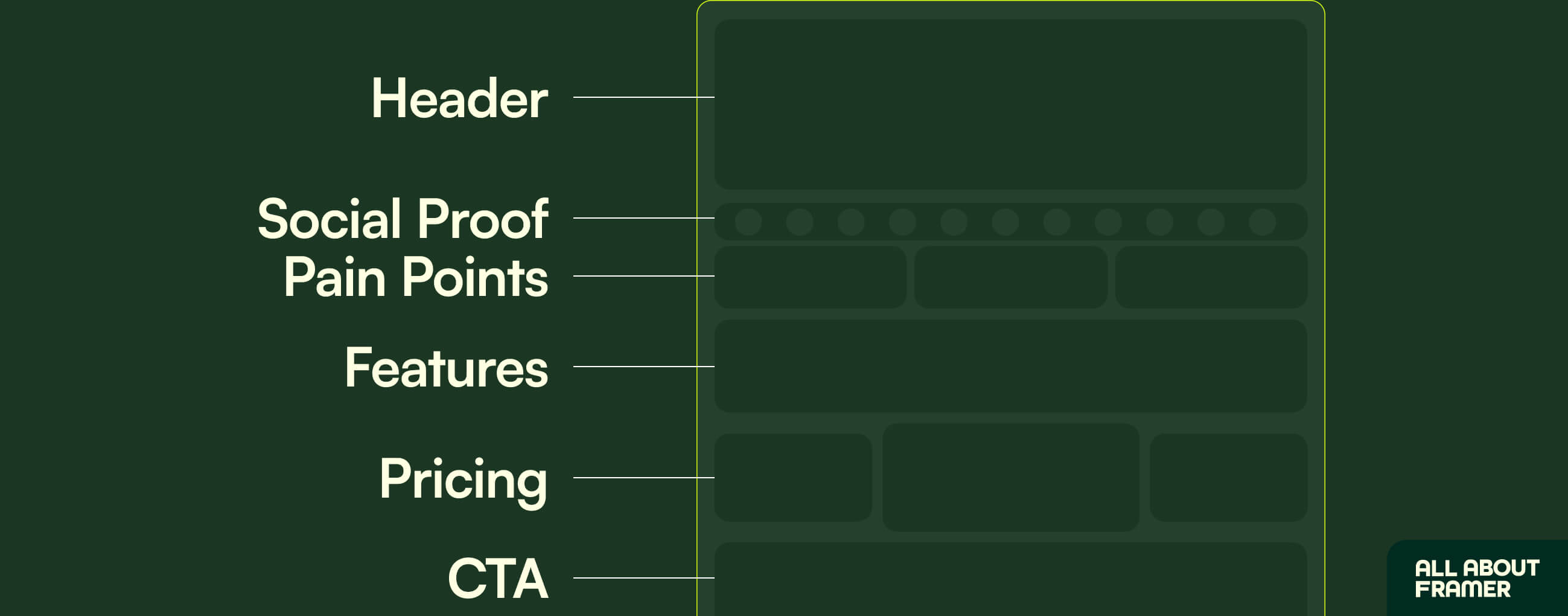
The 6 Sections Every SaaS Landing Page Needs
Here's the structure I use every time.
It's not original. It's not revolutionary. But it works.
Hero
Social Proof
Problem / Pain Point
Features / Solution
Pricing (optional but high-converting)
CTA / Footer
That's it.
Every great SaaS landing page is some variation of these 6 sections. Don't overthink it.
Let me walk you through each one.
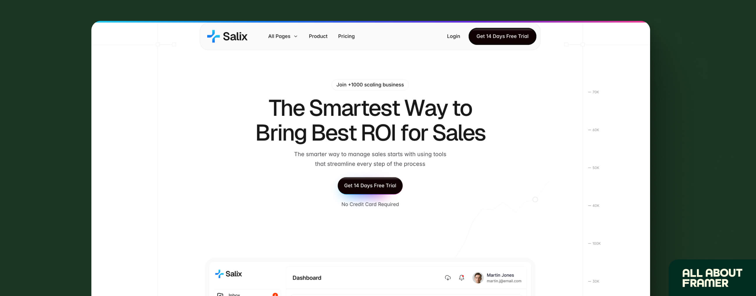
Section 1: The Hero
This is the most important part of your page.
If your hero doesn't work, nothing else matters. People will leave before they scroll.
What your hero needs:
A headline that explains what you do in one sentence
A sub-headline that adds context or a proof point
One CTA button (not two, not three — one)
A visual (product screenshot, mockup, or demo GIF)
The headline formula that actually works:
"[Outcome] for [Audience] — without [Pain Point]"
Example:
"Client proposals that close faster — without the back-and-forth."
That's it. No fluff. No "AI-powered synergy."
How to build it in Framer:
Create a new frame at 1440px width
Add a stack (vertical, center-aligned)
Drop in your headline as a text layer (H1 tag — important for SEO)
Sub-headline below (H2 or paragraph)
Add a button component with your CTA text
Place your product image or mockup to the right (or below for mobile)
Set the frame to 100vh so it fills the screen
Quick tip on the CTA button: Don't say "Get Started." Say something specific.
"Start Free — No Card Needed"
"See It In Action"
"Try [Product Name] Free"
Specific beats generic. Every single time.
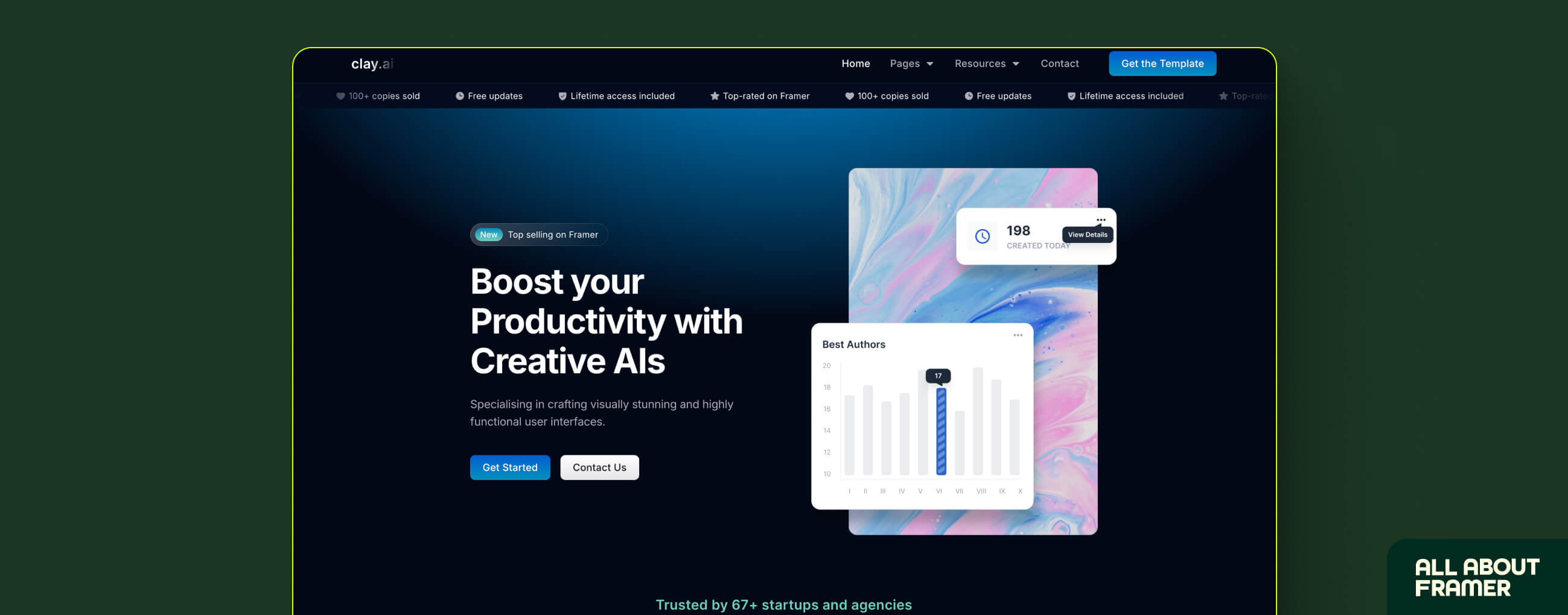
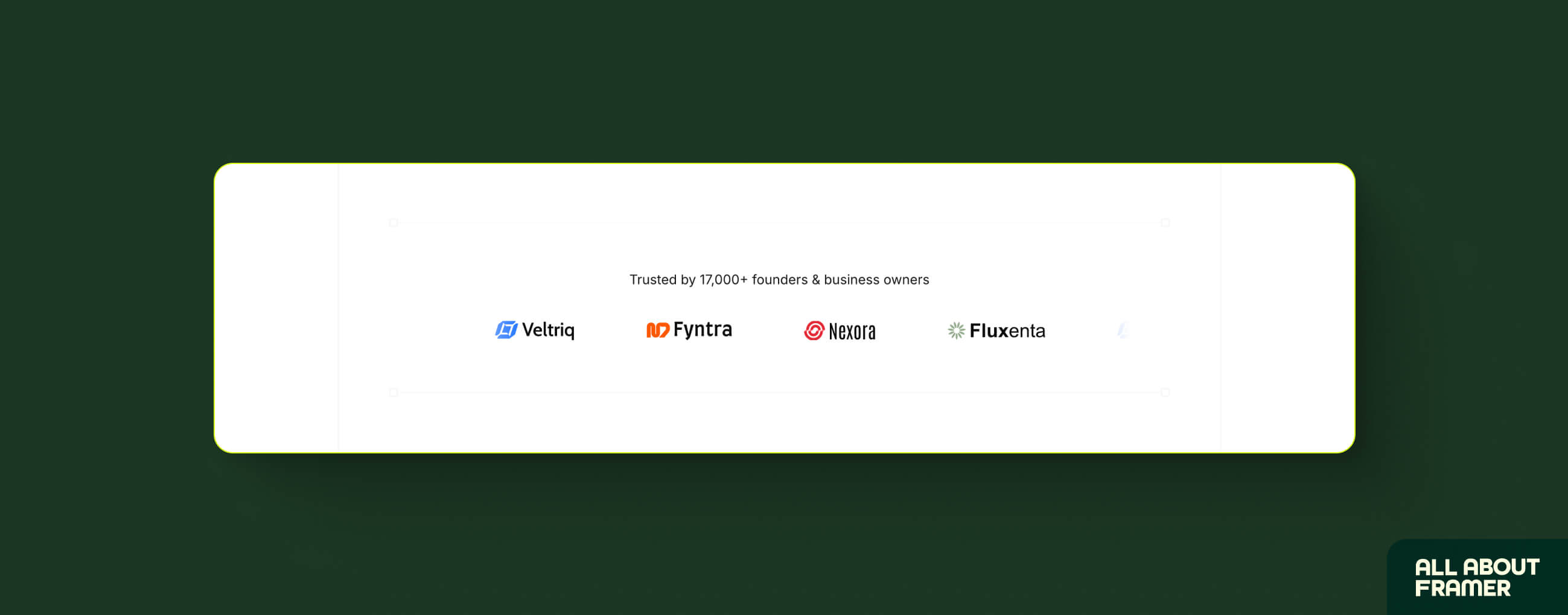
Section 2: Social Proof
Right after your hero, you need trust signals.
Why so early?
Because visitors are skeptical. Within 5 seconds of landing on your page, they're already asking "Is this legit?"
Social proof answers that question before they even ask it.
What to put here:
Logo strip (companies using your product)
A short testimonial or two
A stat (if you have one): "Trusted by 2,400+ teams" or "4.9/5 on G2"
How to build it in Framer:
Create a new frame below your hero
Add a horizontal stack for your logo strip
Drop in company logos (PNG with transparent background)
Below that, add 2–3 testimonial cards in a horizontal row
Each card: name, title, company, quote (keep quotes under 2 sentences)
What if you don't have logos or testimonials yet?
Use beta users. Use early feedback. Use LinkedIn recommendations.
If you genuinely have zero, skip the logos and just lead with a stat you do have. Even "Used by 14 design teams in 3 countries" sounds credible if it's true.
Don't fake it. Ever.
Section 3: The Problem
This is where most SaaS landing pages drop the ball.
They skip straight from hero to features.
Big mistake.
Before you show someone your solution, they need to feel understood. They need to read your landing page and think "okay, these people actually get what I'm dealing with."
Describe the problem vividly. Use language your users actually use.
Bad:
"Managing projects is inefficient and time-consuming."
Good:
"You're spending Sunday night updating a spreadsheet that nobody reads. Your team doesn't know what's due, your client keeps emailing you for updates, and your Notion board has 47 items marked 'in progress.'"
See the difference?
One is abstract. One makes the reader nod their head.
Keep this section simple in Framer. Dark or neutral background. 2–3 pain points listed clearly. Maybe an icon or small illustration per point. Don't over-design it. The words do the work here.
Section 4: Features / Solution
Now you can talk about your product.
But here's the rule: lead with benefits, not features.
Feature: "Real-time collaboration"
Benefit: "Your whole team sees changes the second you make them. No more 'wrong version' moments."
Feature: "AI-powered suggestions"
Benefit: "It catches what you miss. So your proposal goes out polished, not embarrassing."
Option A: 3-column grid. Each column has an icon, a short benefit headline, and 2–3 sentences of explanation. Clean. Scannable.
Option B: Alternating rows. Feature text on the left, product screenshot on the right. Then flip. Works great when you have strong visuals to show.
For alternating rows in Framer, add a subtle fade-up scroll animation on each row. That's where Framer genuinely shines over every other builder.
Section 5: Pricing
Should you include pricing on your landing page?
Short answer: yes.
Long answer: yes, if you have a clear pricing structure. If you're still figuring it out, just add a "Book a Demo" CTA instead.
Here's why pricing works: people who don't care about your price will scroll past it. People who do care will appreciate that you're being upfront. And people who see "Free plan available" will click immediately.
Simple layout: 3 tiers. Always 3.
Free / Starter — basic features, forever free or low cost
Pro — the most popular plan (mark it as such)
Enterprise — custom pricing, "contact us"
Section 6: Final CTA
You've explained the problem. You've shown the solution. You've listed the price.
Now close the deal.
Your final CTA section should restate the core value in one line, repeat the primary button, and add a risk reversal ("No credit card required" / "Cancel anytime" / "Free 14-day trial").
Example:
Stop losing deals to a bad first impression. Start your free trial today — no credit card required. [Try [Product] Free]
Don't add more. Don't repeat your feature list. Just close.
Animations: Where Framer Gets Interesting
Okay. This is the fun part.
SaaS landing pages in Framer don't just look good static. They come alive when you scroll.
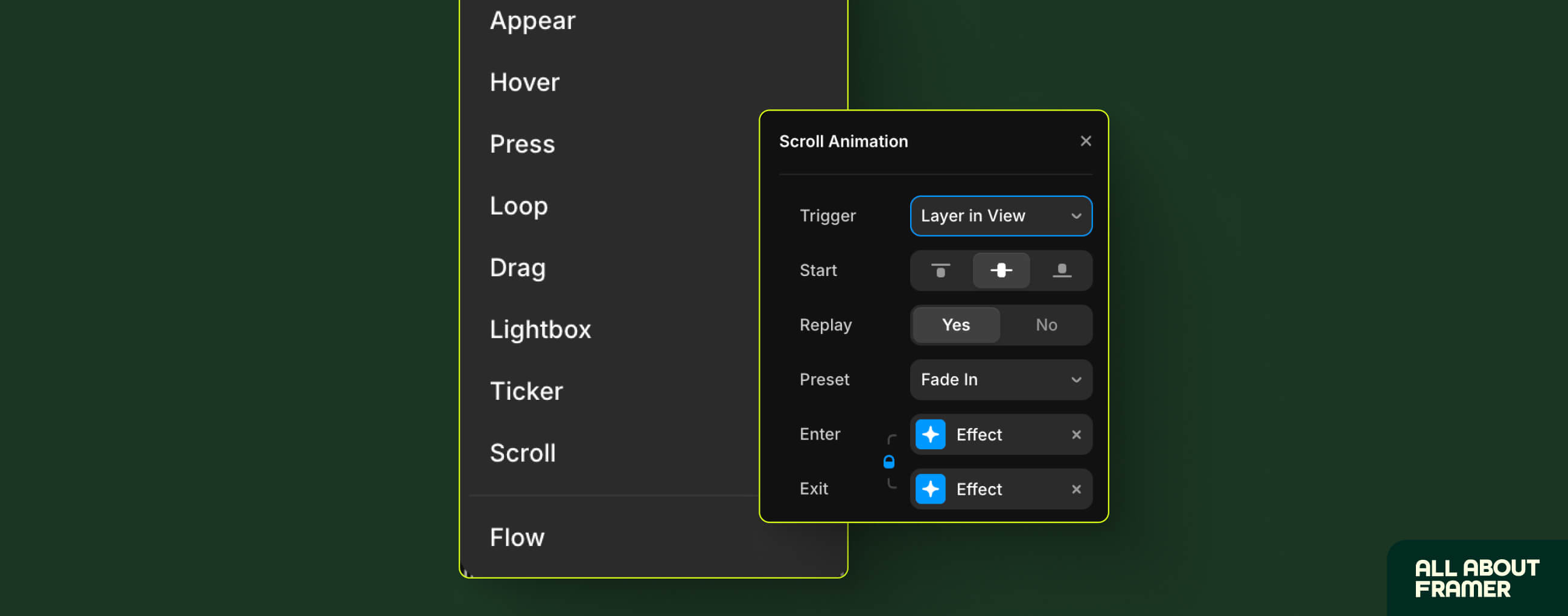
Here's what I add to almost every SaaS page:
Fade-up on scroll: Most sections fade up as the user scrolls to them. It makes the page feel dynamic and polished. Takes 2 minutes to set up in Framer.
Hover states on CTA buttons: Change the background color slightly on hover. Adds that premium feel.
Logo strip auto-scroll: Make your client logos scroll horizontally on loop. Framer has a native scroll component for this. Drop it in, set the speed, done.
Product GIF in hero: Instead of a static screenshot, use a short looping GIF of your product in action. Record your screen for 10 seconds. Export as GIF. Drop into Framer. Massive trust boost.
One rule: don't animate everything. Pick 2–3 effects and use them consistently. Too much movement looks amateur, not impressive.
Mobile Responsiveness
I'm going to say this and I need you to take it seriously.
More than half your visitors are on mobile.
If your SaaS landing page looks broken on an iPhone, you're losing half your potential customers.
In Framer, you set breakpoints. You design for desktop first, then adjust for tablet (768px) and mobile (390px).
We've written a full guide on this — how to create a responsive website in Framer — if you want the deep dive. But for SaaS pages specifically, here's what usually needs fixing on mobile:
Hero headline is too big (reduce font size)
3-column grids need to collapse to 1 column
CTA button needs to be full-width
Navigation should collapse into a hamburger menu
Product screenshots need to resize or be replaced with a mobile-friendly version
Check your mobile view every time you make a major change. Not just at the end.
Seriously. Not just at the end.
SEO Basics for Your SaaS Landing Page
Since you're building this in Framer, here's what you need to handle for SEO.
Page title: Include your primary keyword. Example: "Project Management for Designers | [Product Name]"
Meta description: Benefit + audience + CTA. Under 155 characters.
H1 tag: One per page. Should contain your keyword.
Image alt text: Every image needs a descriptive alt tag. "SaaS landing page hero screenshot" is better than "image1.jpg"
Page speed: Compress your images before uploading. Framer is fast by default, but large uncompressed images will kill your score. See our 8 ways to improve Framer website speed for a quick checklist.
Slug: Keep it clean. /features/project-management not /features/project-management-for-modern-design-teams-who-value-collaboration
For the full SEO foundation, read our Framer SEO beginner guide. It covers everything from meta tags to header structure to indexing.
Common Mistakes I See All the Time
Let me save you some pain.
Mistake 1: Too Many CTAs
Pick one primary action. Everything else is distraction.
Mistake 2: No Mobile Check
Already mentioned this. Still going to mention it again. Our responsive design guide walks through every breakpoint if you need help.
Mistake 3: Generic Copy
"Fast, powerful, and easy to use" describes every SaaS product ever made. Be specific about what makes yours different.
Mistake 4: No Social Proof
Even one real testimonial is better than zero. Get it from a beta user if you have to.
Mistake 5: Ignoring Page Speed
Upload a 4MB PNG hero image and watch your bounce rate climb. Compress everything.
Mistake 6: Launching Without Testing
Click every button. Test every form. Check every breakpoint. Then publish.
Real Talk: How Long Does This Actually Take?
First time building a SaaS page in Framer?
Give yourself 2–3 days.
Experienced Framer user?
Half a day for a solid MVP. A full day if you're going for something polished.
Set a timer. Seriously.
Wrapping Up
A SaaS landing page doesn't need to be perfect. It needs to be clear, fast, and credible.
Framer gives you all the tools to build something that checks all three boxes. You just need to know what you're building before you open the canvas.
The structure is:
Hero (clear headline, one CTA)
Social proof (trust signals early)
Problem (make them feel understood)
Features (benefits first, features second)
Pricing (be upfront)
Final CTA (close clean)
Then add animations where they actually help. Check mobile before you launch. Compress your images. Write copy that sounds human.
That's it.
If you want to see what else is possible in Framer, start with our complete beginner's guide or browse the Framer template gallery for SaaS-specific starting points.
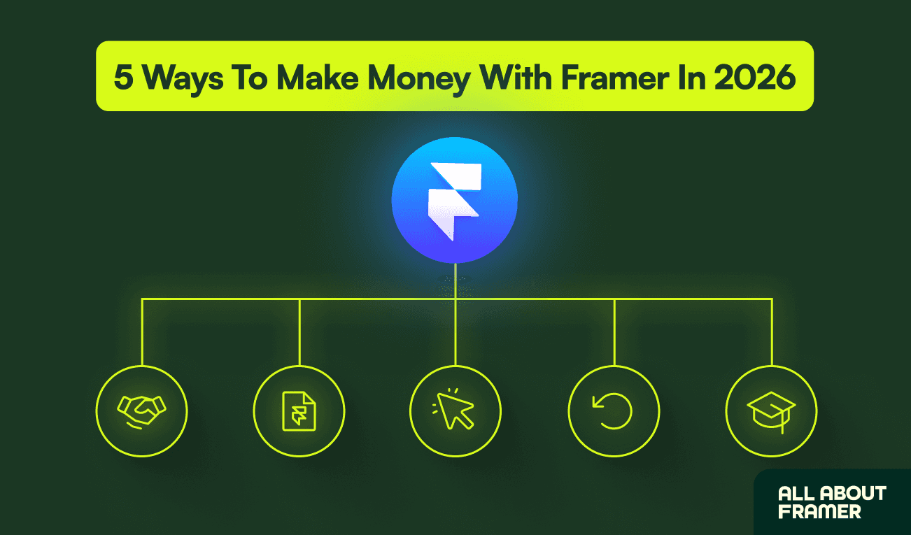
And if you want to turn these skills into income, the complete Framer money guide breaks down exactly how SaaS page designers are charging clients and building passive income on the side.
Go build something.
FAQs
Can I build a SaaS landing page in Framer without coding?
Yes. Entirely. The visual builder handles everything — layout, animations, interactions, responsiveness. You only need code if you're doing something very advanced, like custom API integrations.
How much does it cost to host a SaaS landing page on Framer?
The Basic plan is $10/month per site (billed annually). For a single landing page with a custom domain, that's all you need. Check the full Framer pricing breakdown before choosing your plan.
Can I add a form to collect leads on my Framer landing page?
Yes. Framer has a native form component. You can connect it to tools like Mailchimp, HubSpot, ConvertKit, or just collect submissions directly in your Framer dashboard.
Is Framer good for SEO for SaaS landing pages?
Yes. Framer handles the technical SEO well — fast load times, clean HTML output, custom meta titles and descriptions, sitemap, redirects. See our Framer SEO guide for the full checklist.
How do I add animations to my Framer SaaS landing page?
Select any element, go to the Animate panel, and choose your effect. For scroll-triggered animations, use the "While in view" trigger. Start with a simple "Fade up" effect — 0.4 second duration, slight Y offset. Looks great on any section.
We publish free guides, templates, and Framer tutorials at All About Framer. If you'd like help building your SaaS landing page or want personal guidance on your first client project, book a free consultation here.