So, you’ve seen those smooth Framer websites and thought…
“Damn, I want to make that too.”
Let’s be real.
The world of websites feels scary when you’re just starting.
Words like “HTML,” “CSS,” and “JavaScript” sound like secret codes that only hackers understand.
But here’s the good news: you don’t need to know how to code to build something beautiful, functional, and professional.
Framer is different.
Think of it as Canva but for websites. It’s a no-code tool that lets you design, build, and publish websites all in one place.
And the best part? It’s made for beginners.
Now, why 30 days?
Because one month is enough to go from zero knowledge to actually building and publishing your first website.
You don’t need years of training. You don’t need a degree. What you need is consistency.
Just imagine: in 30 days, you’ll have a skill that not only lets you create websites for yourself but could also help you earn money by making sites for others.
Which Track Should You Follow? Role-Specific 30-Day Roadmaps
This 30-day guide works for everyone. But your role determines what to focus on.
Track 1: Designer (Coming from Figma/Adobe)
What to emphasize:
Days 1–9: Visual design environment (it's like Figma)
Days 10–15: Cloning professional sites (nail the aesthetic)
Days 16–20: Animations (your superpower in Framer)
Days 21–25: Working with real clients
Days 26–30: Selling templates
Time allocation: 60% design, 30% functionality, 10% code
Your end goal: Beautiful, animated Framer sites. Maybe some template sales.
Expected earnings: $2,000–$5,000/month within 6 months.
Track 2: Developer (Coming from React/Vue/Code)
What to emphasize:
Days 1–9: Skip the basics (you know HTML/CSS already)
Days 10–15: Code components and custom logic
Days 16–20: API integration (Fetch, webhooks, third-party tools)
Days 21–25: Building "headless" Framer experiences
Days 26–30: Positioning yourself as a technical Framer expert
Time allocation: 20% design, 70% functionality/code, 10% client work
Your end goal: Complex, powerful Framer sites that need custom code. High-end client work.
Expected earnings: $4,000–$10,000+/month within 6 months (developers charge more).
Track 3: Marketer (Coming from landing page builders, no coding)
What to emphasize:
Days 1–9: Understand the basics (simpler than you think)
Days 10–15: CMS (for blogs, case studies, resources)
Days 16–20: Forms and tracking (analytics, lead capture)
Days 21–25: Optimization (CTR, conversion funnels)
Days 26–30: Building your marketing site as a portfolio
Time allocation: 40% design, 40% CMS/marketing features, 20% analytics
Your end goal: High-converting landing pages and marketing sites.
Expected earnings: $2,500–$6,000/month within 6 months (agencies hire marketers who can build).
The core learning is the same. The emphasis is different.
Pick your track. Spend extra time on your strength. Move faster on the rest.
Sounds like a good deal, right?
Before that, here's a word from our sponsor:
🚨 Why pay $79–$129 for just one template…when you can get 30+ templates for less? Most “premium” templates lock you into one layout, one style, and zero flexibility. With Pentaclay, you get an ever-growing library that gives you freedom to build websites your way—without extra cost. ✨ What’s inside Pentaclay: • 30+ Framer & Figma templates • 5–7 new templates added every month • Unlimited commercial licenses • Lifetime access available • Priority support
Day 1–3: Understanding Websites Without Jargon
Before we dive into Framer, let’s clear one thing up: what is a website, really?
Think of a website like a house.

The HTML is the structure (walls, floors, roof).
The CSS is the design (paint, furniture, decorations).
The JavaScript is the interactive stuff (doors that open, lights that turn on when you clap).
That’s it.
Now here’s the secret: when you use Framer, you don’t need to actually write this code.
Framer does it for you.
But understanding the “house” analogy will make everything easier.
Why does this matter? Because once you know the basics, you’ll stop being scared of the terminology.
“CSS” won’t sound like a monster under your bed anymore.
By Day 3, your only job is to look at websites differently.
Open your favorite websites and ask:
What’s the structure?
What’s the decoration?
What’s interactive?
Congratulations, you now understand websites at a fundamental level.
And you didn’t even touch code.
Day 4–9: Getting Comfortable Inside Framer
Now it’s time to actually open Framer.
When you first launch it, the screen can feel overwhelming.
There are panels, menus, and mysterious words everywhere.

But don’t panic. Once you know what’s what, it’s like moving into a new apartment. You’ll get used to where everything is.
Important note before we start: there are way more items in both the top bar and the right column than what I’m going to cover here.
But as a beginner, you don’t need all of them right away.
I’ll walk you through the ones that matter most right now.
The Left Column in Framer

This is where your pages, layers, and assets live.
• Pages = the different rooms of your house (Home, About, Contact).
• Layers = the items inside each room (sofa, lamp, rug).
• Assets = all the reusable stuff (images, icons, logos).
Think of this as your website’s “inventory list.”
The Top Bar in Framer

This is where you insert new elements.
Text, buttons, images, shapes, even entire sections.
You’ll also see CMS here.
Think of CMS (Content Management System) as a smart notebook where you store reusable information—like blog posts, client testimonials, or product details.
You can read a detailed beginner's guide about the CMS here.
Later, you can connect that notebook to different parts of your website.
For now, just know it’s like a magic storage system.
The Right Column (Properties Panel) in Framer
This is where the fun (and sometimes confusion) happens.
It controls how your website elements look and behave.
Let’s go step by step.
Position

Relative: This is the default. Your element sits naturally in the flow of the page. If you add text under a button, the text goes below it.
Absolute: Imagine putting a sticker on a wall. Absolute lets you place an element exactly where you want it, ignoring the natural flow. It stays stuck to its parent container.
Fixed: Ever seen a navigation bar that stays on the screen no matter how far you scroll? That’s fixed. It’s glued to the screen.
Sticky: Think of sticky notes. They stay in place until you scroll past a certain point, then they move with the page.
Sizing

Fill: The element stretches to take up all available space. Like water filling a glass.
Fit: The element adjusts to fit the content inside it. Like a T-shirt that shrinks to your body size.
Fixed: The element stays one size, no matter what’s around it. Like a framed photo on a wall.
Layouts (Stacks)

This is one of the most important parts.
Flex layouts help you control how elements line up:
Row (items side by side)
Column (items stacked)
Space-between (items spread out evenly)
Think of Lego blocks. You can stack them up or line them across. Flex is just Lego for websites.
Want a detailed guide about Stacks? Check this out.
Styles Tab

This is where you make things look nice.
Colors, backgrounds, images, borders, shadows, opacity, visibility—it’s all here.
Want rounded buttons? Change the border radius.
Want a card that looks like it’s floating? Add a shadow.
Accessibility

This one might feel boring at first, but it’s important.
Accessibility tags let people using screen readers navigate your site.
It also makes Google happy because it improves SEO.
The goal for Days 4–9 in learning Framer:
Don’t aim to master every single button.
Just play.
Move things around. Resize them. Change a button color. Make a headline huge, then tiny. Add a shadow, then remove it.
The more you click, the less scary it becomes.
By the end of this phase, you’ll no longer see Framer as a foreign spaceship dashboard.
It’ll feel like your playground.
Day 10–15: Copying to Learn (The Clone Phase)
Alright, here’s the honest truth.
The fastest way to learn design isn’t by starting from scratch.
It’s by copying.
Not to publish. Not to steal. Just to practice.
Go to the Framer Template Gallery.
Pick a design that looks professional. And recreate it pixel by pixel.
At first, it’ll feel a little boring. Like tracing in an art class.
But here’s what happens:
You start noticing spacing. Why the headline is larger, and the subheading is smaller.
You understand alignment. Why the button sits here, not lower.
You see how colors and typography work together.
It’s like suddenly being able to read the design instead of just looking at it.
The Benefits of Cloning a Framer Website
You don’t waste time guessing layouts.
You instantly get hands-on with “good design” rules.
You learn shortcuts you wouldn’t discover on your own.
A Word of Caution
Never publish these cloned sites.
This isn’t about claiming credit.
It’s about training your eyes and hands to follow professional logic.
Think of it like learning to cook by following a famous chef’s recipe step by step.
You’re not inventing your own dish yet.
You’re learning technique.
The goal for Days 10–15 in learning Framer:
By Day 15, you’ll have a few cloned projects that look eerily close to the real thing.
And you’ll feel something click: “Okay, now I get it.”
Day 16–20: Building Your First Projects
Now that you’ve cloned, it’s time to create.
This is where things get exciting.
Because suddenly, you’re not just copying someone else’s recipe—you’re experimenting in your own kitchen.
Don’t aim for perfection.
Aim for practice.
Here are some sample projects to help you get started:
Framer Project #1: Local Plumber Website
Structure: hero section, about, services, contact.
This teaches you flow and hierarchy.
Framer Project #2: Photographer Portfolio
This is where CMS comes in.
You’ll add photo galleries and client testimonials.
Now you’re learning how to handle collections of content.
Framer Project #3: AI Startup Landing Page
Minimal, futuristic, bold fonts.
Here you’ll learn that sometimes less is more.
Framer Project #4: Vegan Taco Restaurant
Fun, colorful, tasty.
You’ll build a menu, reviews, and a map.
This teaches you to balance visuals with function.
Framer Project #5: Resume Site
Clean. Straightforward. To the point.
Bio, skills, work experience, contact.
Here, you’ll practice clarity and readability.
The goal for Days 16–20 in learning Framer:
You’ll start combining lessons from cloning with your own creativity.
Like: “Oh, I liked that layout I copied, maybe I’ll use it here but with new colors.”
By Day 20, you’ll have a handful of mini-projects you actually created yourself.
And suddenly, you’re not just following.
You’re building.
Day 21–25: Working With Real People
Up until now, you’ve been practicing in your own bubble.
But the real growth happens when you design for actual humans.
Why?
Because people never ask for what you expect.
Who Should You Start With?
A friend who freelances and needs a simple portfolio.
Your cousin’s side hustle selling candles.
The local bakery that still posts their menu on Instagram Stories.
These are goldmines.
They’re not picky. They just want something better than “nothing.”
What You’ll Learn Designing Framer Websites
Working with real people forces you to practice skills tutorials can’t teach:
Asking, “What do you really want your site to do?”
Prioritization. Cutting out fluff and focusing on what matters.
Deadlines. Even casual ones help you finish instead of endlessly tweaking.
Watch Out for These Common Framer Mistakes
Overdesigning: Too many colors, too many fonts, too many animations. Less really is more.
Forgetting mobile: Most people will view your site on their phone. If it looks bad, they’ll bounce.
Not clarifying needs: You might spend 3 days perfecting a gallery when all they wanted was a contact page.
By Day 25, you’ll have delivered something useful to someone else.
And that changes everything.
Because suddenly, you’re not just “learning Framer.”
You’re building websites that matter.
Day 26–30: Publishing and Going Public
You’ve played.
You’ve cloned.
You’ve built.
You’ve even helped someone.
Now it’s time to hit the big button: Publish.
Step 1: Polish Your Framer Projects
Don’t try to fix everything.
But do clean up the obvious:
Make sure spacing is consistent.
Check fonts aren’t all over the place.
Test on both desktop and mobile.
Ensure you have the best SEO practices implemented.
Step 2: Publish a Real Framer Website
With Framer, publishing is ridiculously easy.
One click, and your site is live with a free framer.website domain.
Or, if you’re feeling bold, buy a domain (like myportfolio.com) and connect it.
Step 3: Share It With the World
Don’t keep it a secret.
Post on LinkedIn, Twitter, or even Instagram Stories.
Write: “Hey, I just built my first website in Framer. Would love feedback.”
People love seeing beginners share progress.
The best place to get feedback is the Framer community and the Framer subreddit.
Step 4: Keep Going
Day 30 isn’t the finish line.
It’s just the beginning.
By now, you’ll have:
Cloned 2–3 professional sites.
Built 3–5 original projects.
Created at least one site for a real person.
Published something live on the internet.
That’s a solid foundation.
Keep practicing, keep sharing, and you’ll only get better.
Is Learning Framer Worth It in 2025?
Okay, time for the big question.
Is it worth it?
The short answer: yes. The long answer: hell yes.
Framer recently raised $100 million.
That means investors believe it’s not just a fad—it’s here to stay.

In June 2025 alone, Framer paid over $530,000+ to creators.
That’s money flowing directly to people who design templates, client sites, and digital products.
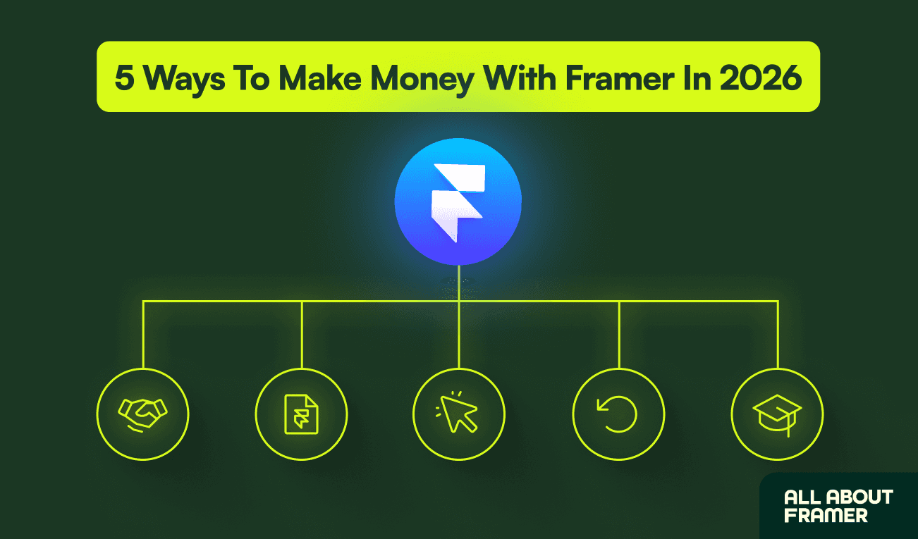
Once you've completed this 30-day journey, you're ready to start earning. See how to make money with Framer.
Who’s Using Framer?
Not just indie hackers.
Big names like Loops, Contra, Huel, and Cal.com are building on it.
If billion-dollar startups are betting on Framer, that should tell you something.
Why It’s Smart to Learn Framer Now
Low barrier. No coding needed.
High ceiling. You can go from beginner projects to pro-level designs.
Career-ready. Freelancing, templates, or even landing jobs where Framer is the main tool.
Think of it like this:
In the 2000s, people who learned WordPress early built entire careers.
In the 2010s, people who learned Webflow became highly in demand.
Now, in the 2020s, Framer is taking that spot.
Learning it now is like buying a ticket early before the train takes off.
Want More?
We publish free guides, templates, and tutorials at All About Framer
If you’d like personal guidance on your first project or making money with Framer, book a free consultation here: Book with Us